One of the worst crimes against nature in the Salesforce universe is activating Lightning and merely accepting the default Lightning Page Layouts that are created for each Object. As admins, we should thoughtfully take the time to create a Lightning Page Layout for each one in use in Classic. Some tips for doing this include:
Learn the Lightning Page Formats and Standard Components
When you go to create your first Lightning Page, you are asked to choose which of the three types you want.

They are App Page, Home Page and Record Page. As of Summer ’18, they come with the following number of Standard options.
| Lightning Page Type | Standard Templates | Standard Components |
|---|---|---|
| App Page | 8 | 10 |
| Home Page | 1 | 21 |
| Record Page | 12 | 20-26 |
App Pages are only available in Lightning. They allow us to put a mixture of items on to a page, such as a Dashboard, Report Charts, and List Views. With them we have many more options for Templates than Home Pages, but less than half the number of Standard Components.
It is important to play with the Standard Components, and really test drive them, to understand how they will impact User experience in your system.

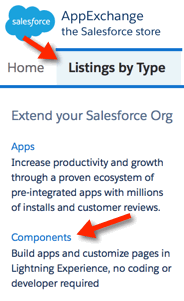
Keep an Eye on Free Components on the AppExchange
As of today there are 160+ FREE Lightning Components available for download on the AppExchange. You might just find the visualization of related data (ie an editable grid) you wanted, or a nifty way to jazz up a layout (ie a map showing contacts associated to an Account). Most Components are simple to download and incorporate into your pages. There are also Components available for paid apps you might already be using. This list grows steadily and is worth watching.
Remember that Developers Can Write Custom Templates and Components
There are many things that developers can do on the Salesforce platform that admins can only dream of. Lightning offers the ability for a developer (or adventurous admin) to create custom Lightning Page Templates and Components. There are a variety of Trailhead Modules which explain how to start.
 Take Advantage of Component Filters
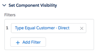
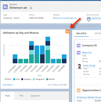
In Lightning Page Layouts, Salesforce has given us a cool ability to dynamically display Components. We do this by clicking on a particular Component and adding a Filter in the Properties. We might, for example, show a Report Chart with a customer’s Utilization on an Account Layout. But we might only if the Account Type is Customer – Direct. When we add a Filter to a Component, Salesforce displays a small orange icon in the top right of that Component in the Lightning Page Layout edit screen. When viewing the page, if the Filter yields a False result, Salesforce omits the Component from the page entirely. In the case below, the Chatter Component would simply move up to fill in the space.

New Options for Assigning Page Layouts in Lightning
In Salesforce Classic, we’ve been able to assign Page Layouts by Profile and Record Type. In Lightning, we see new, clearer options, such as assigning as Org Default or as App Default. We can also be more granular in assignment by choosing App, Record Type, and Profile.


